

Overview
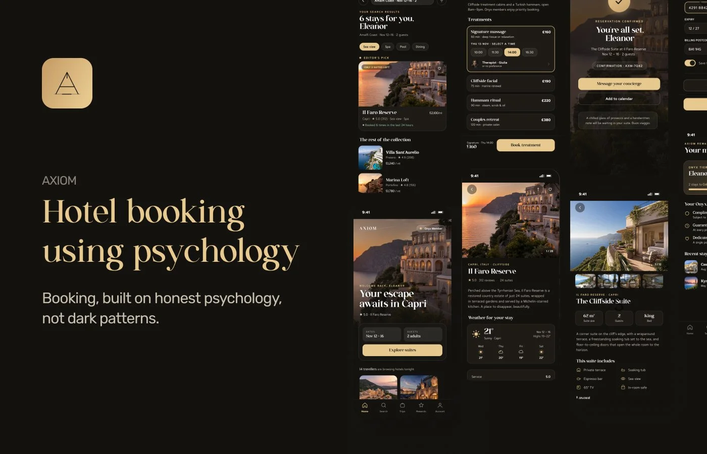
Most booking apps use psychology as a lever to pull — countdown timers, invented scarcity, fees that appear at the last possible step. Axiom takes a different approach: use the same psychological principles the industry already relies on, but only where the underlying information is genuinely true and fully disclosed. Every decision in this concept — from the colour palette to the wording on a cancellation screen — was tested against one question: would this still work if we explained exactly how it works to the user's face?
The result is a full booking-to-stay experience for a fictional luxury property brand, Il Faro Reserve — search, room selection, payment, cancellation, and in-stay services — designed to feel calmer and more trustworthy precisely because nothing on screen is trying to trick anyone into anything.
The Problem With Booking UX
The travel industry is one of the most persuasion-heavy corners of UX design, and not always in a good way. Fake "X people are viewing this" counters, artificial urgency, drip pricing revealed only at checkout, guilt-tripping copy on declined upsells — these patterns work in the short term because they exploit real psychological responses (loss aversion, social proof, scarcity). But they work because they're deceptive, which is the tell. The moment a user suspects a number is fake, the whole interface loses credibility — including the parts that were telling the truth.
Axiom starts from the position that this is a false trade-off. The same psychological mechanisms that make dark patterns effective also make honest design effective — arguably more so, because trust compounds. A scarcity claim someone can verify is more persuasive than one they can't, precisely because they can tell the difference.
The Psychology at Play
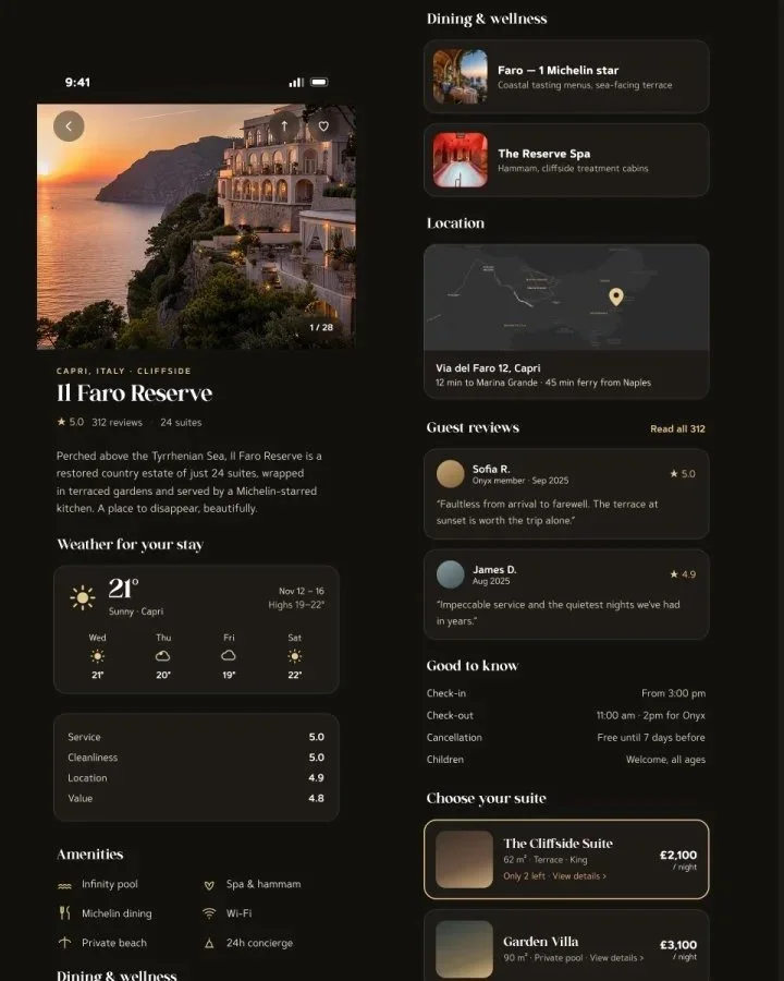
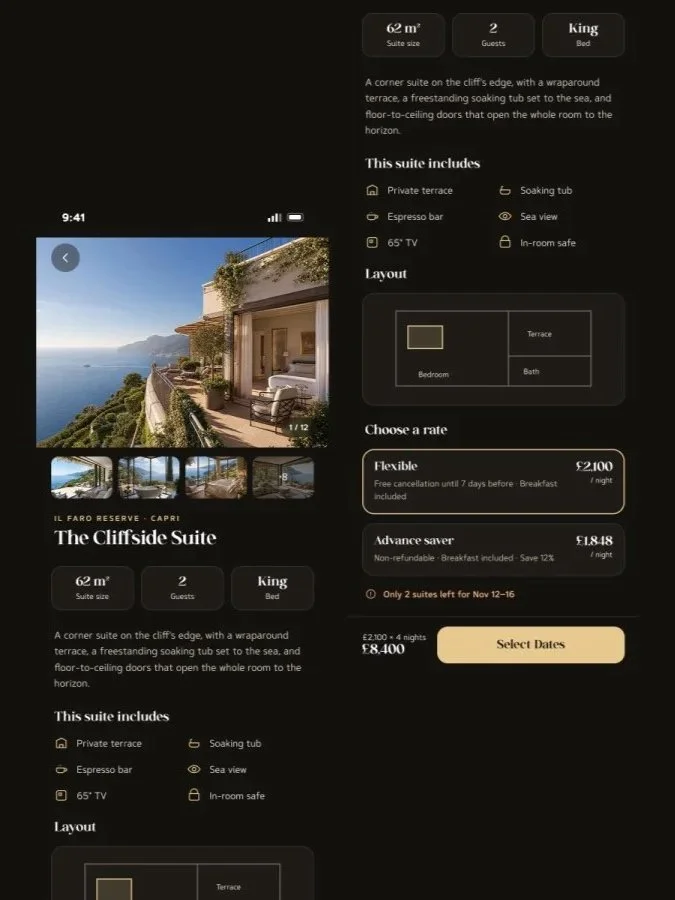
The scarcity heuristic, made verifiable. People weight scarce options more heavily — but only if the scarcity is believed. When Axiom shows "Only 2 suites left," it's because the property's full inventory (24 suites) is disclosed elsewhere in the flow, so the claim is checkable rather than asserted. This matters because of a second effect layered on top: a verifiable claim triggers genuine urgency, while a claim that can't be checked gets discounted or ignored entirely. Honest scarcity isn't just the ethical choice here — it's the more effective one.
Transaction utility, protected. Behavioural economist Richard Thaler's concept of transaction utility describes how people judge a price not just by what they get, but by whether it matches what they expected to pay — a mismatch (a fee appearing late) creates a negative reaction disproportionate to the actual amount. Axiom shows the same total — nightly rate, taxes, fees — at Room Details and again at Review & Pay, so expected price and final price never diverge. Nothing is left to generate that late, souring surprise.
Loss aversion, used defensively. Kahneman and Tversky's prospect theory shows people feel the pain of a loss roughly twice as strongly as the pleasure of an equivalent gain — which is exactly what makes fake urgency ("book now or lose this rate!") so effective, and so manipulative. Axiom applies the same principle in reverse: cancellation terms are stated as reassurance ("Free cancellation until Nov 5") before commitment, and the cancellation screen itself confirms plainly, "Full refund — you're within the free cancellation window." The same psychological lever, aimed at reducing anxiety instead of manufacturing it.
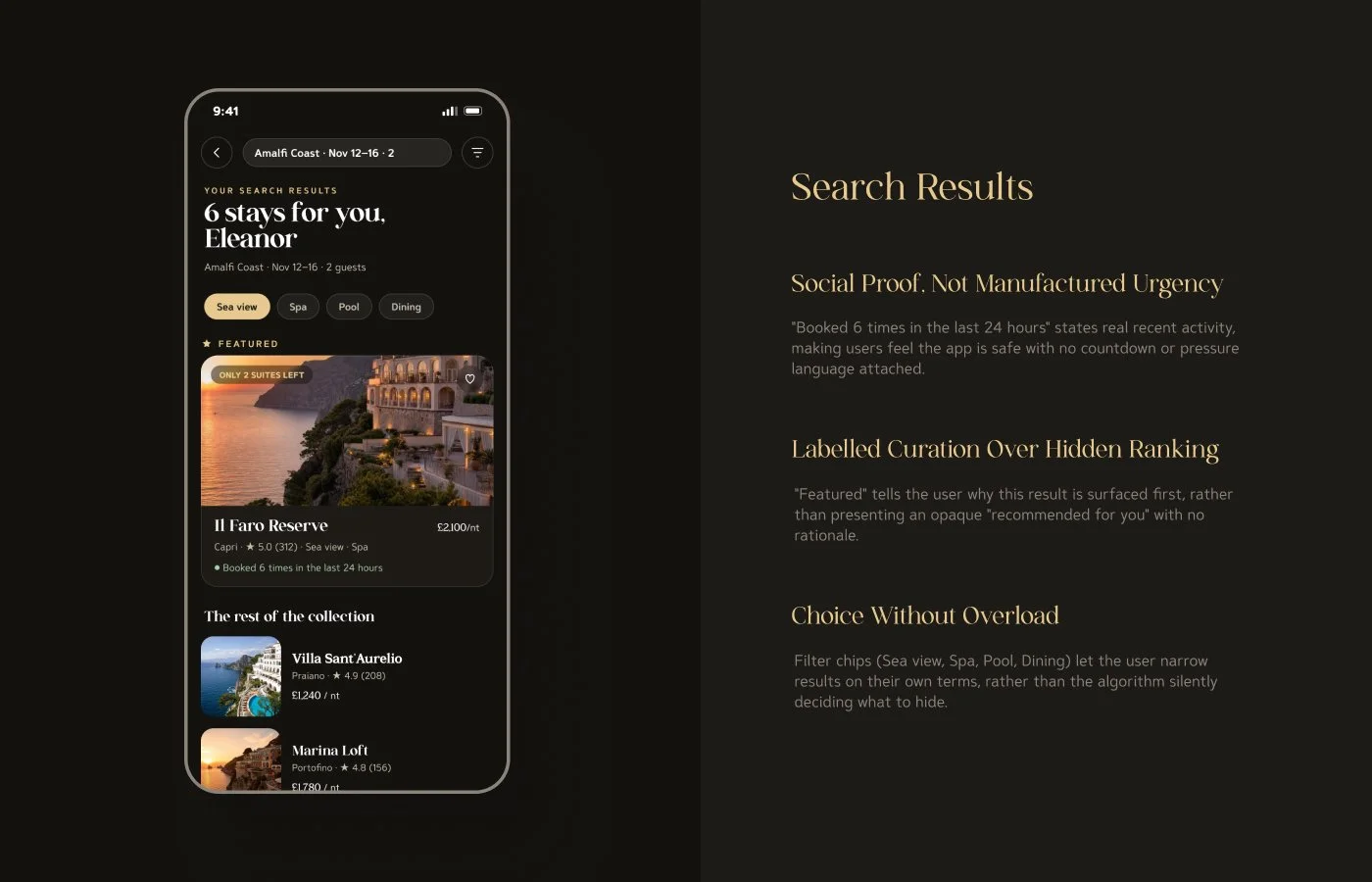
Social proof, kept genuine. Cialdini's social proof principle — people look to others' behaviour to judge their own choices — is one of the most reliable levers in persuasion design, and one of the most commonly faked. "Booked 6 times in the last 24 hours" and a full, attributable review breakdown (service, cleanliness, location, value) are real signals rather than manufactured popularity badges, which is what allows the principle to keep working instead of collapsing the first time a user doubts it.
The peak-end rule. Kahneman's research shows people judge an experience overwhelmingly by its peak moment and its ending, largely ignoring duration. Axiom's confirmation screen — "You're all set, Eleanor" — is designed as a deliberate emotional peak-and-ending: warm, specific, personal, closing the flow on relief rather than a bare transaction receipt, because this single moment disproportionately shapes how the entire booking gets remembered afterward.
UX Principles in Practice
Progressive disclosure on data-dense screens. Room details, pricing breakdowns, and hotel information are layered rather than dumped at once — headline facts first (price, dates, cancellation terms), full detail available a tap further in. Keeps every screen scannable under time pressure without hiding anything from a user who wants the detail.
Structured input over open text. Special requests (dietary needs, occasion, arrival preferences) use checkboxes rather than a blank field — removing the burden of having to generate a request from nothing, and keeping the range of possible asks legible at a glance.
Itemised pricing, not a single opaque total. Nightly rate, taxes and fees, and any member credit are broken out as separate lines rather than folded into one number — directly supporting the transaction-utility principle above by making the composition of the price checkable, not just the total.
Chunked information architecture. Every screen groups related information into distinct, visually separated blocks (trip summary, guest, payment) rather than one dense continuous flow — reducing the moment-to-moment cognitive load of parsing a screen while distracted, rushed, or simply on a small mobile viewport.
A single, consistent accent colour reserved for calls to action. The palette's one warm accent appears almost nowhere except primary buttons, so its meaning stays stable throughout the flow — the user learns, without being told, that this colour always means the next honest step.

Visual Identity
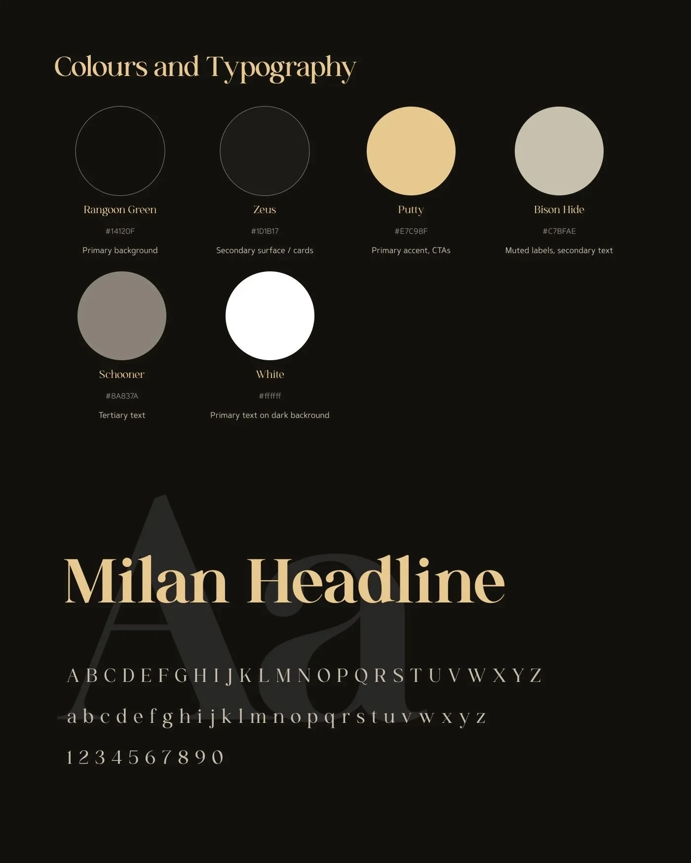
Axiom's palette is deliberately restrained — a warm, low-contrast dark theme (Rangoon Green, Zeus, Putty, Bison Hide) built so nothing on screen competes with the photography for attention. The single accent colour is reserved almost exclusively for calls to action, so its meaning stays consistent throughout: this is the next honest step.
Typography splits by role: an elegant serif (GC Milan Headline) carries the emotional beats of the flow — "Your escape awaits in Capri," "You're all set, Eleanor" — while a clean, highly legible sans-serif (Caldina) carries every functional element: prices, labels, buttons, form fields. Warmth where warmth is earned; clarity everywhere else.
What's Deliberately Not Here
Dark patterns work by hiding the truth or inventing pressure that isn't there. Axiom is built on the bet that neither is necessary:
No countdown timers, fake or otherwise
No fees revealed at the last step
No pre-ticked add-ons or confirmshaming copy on declines ("No thanks" means no thanks, nothing more)
No manufactured "X people are looking at this" claims — any activity signal shown is real, concurrent app usage, not an invented number
Final Thought