

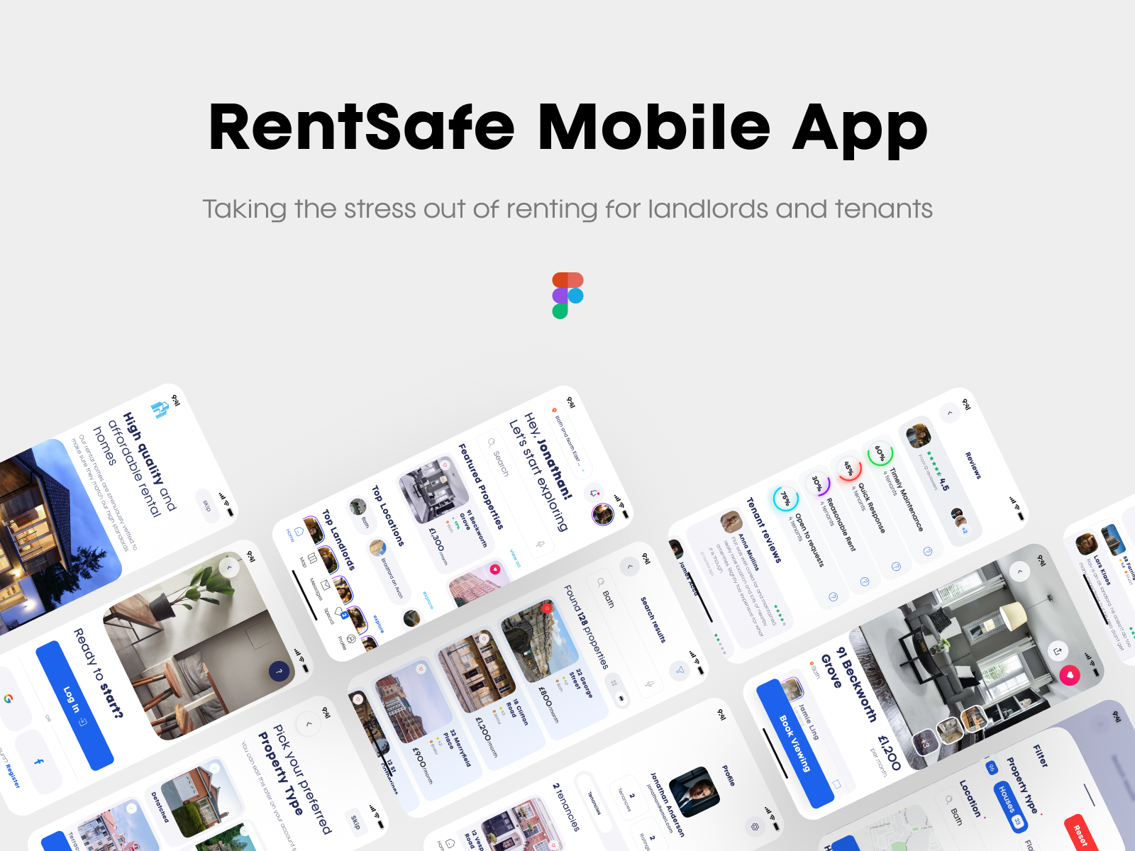
Overview
Renting has a trust problem on both sides. Landlords are asked to hand over a property based on a reference letter and a gut feeling. Tenants are asked to sign a year-long commitment based on a viewing and a hope that maintenance requests won't disappear into a void. Neither side has any real, ongoing evidence to go on — just anecdote, and whoever tells the better story.
RentSafe removes the guesswork by logging the relationship itself: rent payments, maintenance requests, how quickly they're resolved, how reasonable a request like keeping a pet was handled. Landlords and tenants rate each other on the same structured categories, built from real activity in the app rather than a one-off impression. The result isn't a platform that manufactures trust — it's one that makes trust visible, specific, and something both sides have to actually earn.
The Problem With How Renting Works Today
Most rental platforms solve half the problem. They help a tenant find a property, or help a landlord find a tenant — but once the tenancy starts, the platform's job is basically done. Everything that happens afterwards (does the landlord fix things promptly, does the tenant pay on time and look after the place) happens entirely off-platform, undocumented, and unavailable to whoever comes next. A landlord evaluating a new tenant is working from almost nothing. A tenant evaluating a new landlord is working from even less.
RentSafe treats the tenancy itself as the source of truth, not just the moment of finding one.
The Psychology at Play
Uncertainty reduction / the ambiguity effect. People are measurably more averse to unknown risk than to known risk, even a fairly high one — this is the ambiguity effect, and it's arguably the core psychological problem renting has. A landlord doesn't necessarily need a guarantee a tenant will be perfect; they need the unknown to become known. RentSafe's entire premise is built to convert ambiguous risk ("might this tenant/landlord be bad?") into evidenced risk ("this landlord has fixed 60% of maintenance issues promptly, based on 4 tenants") — and evidenced risk, even imperfect, is calculated as far less threatening by the brain than the unknown.
The fairness heuristic, made structural rather than stated. People judge a system's legitimacy heavily by whether it feels procedurally fair, independent of the outcome. RentSafe's rating categories are deliberately symmetrical — landlords and tenants are scored on matching structures (responsiveness, reliability, communication) rather than different, incomparable scales. This isn't just a design choice, it's what makes the platform's fairness claim psychologically credible rather than a marketing assertion the user has to take on faith.
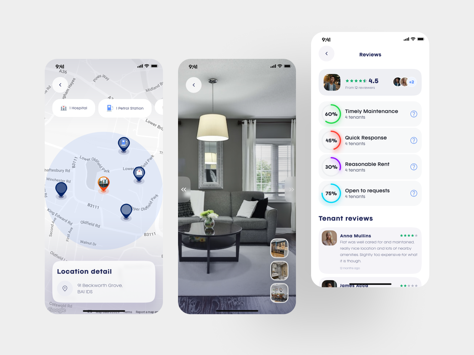
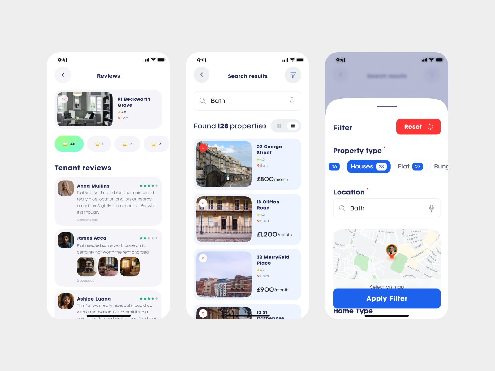
Negativity bias, respected rather than suppressed. People weigh negative information more heavily than positive information when forming trust judgements — it's an evolved caution mechanism. Most platforms fight this by hiding or diluting negative reviews, which backfires: an all-positive review set reads as inauthentic precisely because it violates the negativity bias a user is unconsciously applying. RentSafe keeps real criticism visible ("slightly too expensive," "wouldn't discuss us getting a cat") specifically because a rating system that satisfies negativity bias honestly is far more persuasive than one that suppresses it.
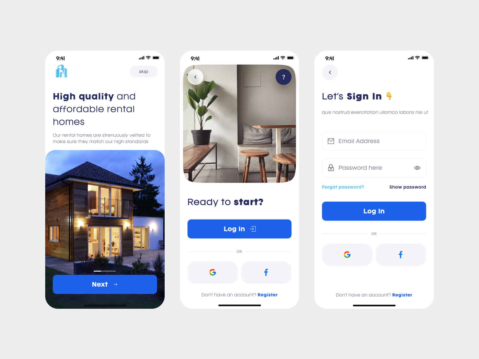
Loss aversion, applied to commitment, not just money. Onboarding repeats "you can edit this later" at every step — search area, property type, payment. Loss aversion doesn't only apply to financial loss; the feeling of an irreversible choice (even a trivial one, like a preferred property type) creates measurable hesitation. Making every early choice explicitly reversible removes that friction at the exact moments a new user is most likely to abandon setup.
The verifiability heuristic. A claim a person can check is trusted disproportionately more than a claim they can't — this is the same principle behind Axiom's disclosed-inventory scarcity, applied here to search and rating data. "Found 128 properties," "from 4 tenants," "Houses 33" — every number on screen is stated with enough specificity that it reads as checkable, not asserted, which is what makes the platform's central promise (evidence over anecdote) feel true rather than just claimed.
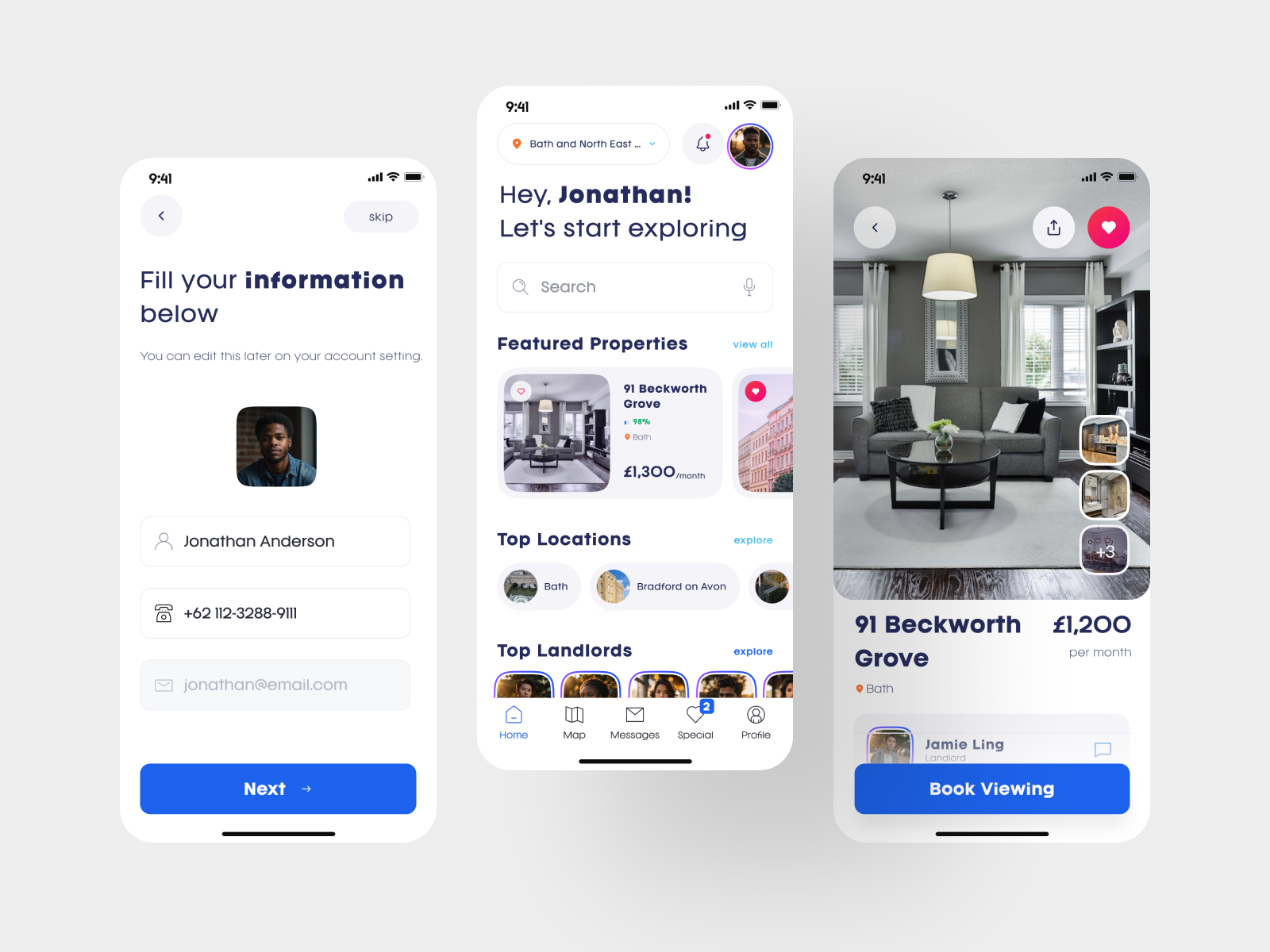
Recognition over recall. Property cards lead with photo, price, and match score; nearby amenities are shown spatially on a map rather than as a list. This is a basic cognitive-load principle — recognising something you can see is far less effortful than recalling something you were told — applied so the user's mental effort goes toward the actual decision, not toward remembering what they scrolled past two screens ago.
UX Principles in Practice
Structured criteria over a bare aggregate score. A single 4.5-star average collapses a lot of different information into one number that's hard to act on. Breaking it into named, defined categories — Timely Maintenance, Quick Response, Reasonable Rent, Open to Requests, each with a tap-to-expand explanation of what it actually measures — turns a vague impression into something a user can actually reason with, and is a direct implementation of the fairness and verifiability principles above, not just a stylistic choice.
Progressive disclosure on data-dense screens. Reviews, ratings, and property detail are layered rather than dumped at once — headline scores first, full review text and photo evidence available a scroll or tap further in. Keeps the initial decision-making screen scannable without hiding detail from anyone who wants it.
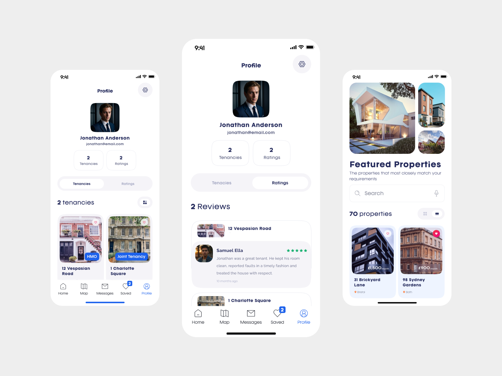
Consistent card and layout language throughout. Property listings, saved items, and profile tenancies all use the same card structure (image, headline stat, location, price/rating) — reducing the interface's own learning curve so attention stays on the content, not on re-learning how to read each new screen.
Transparent filtering with live counts. Filters show result counts per option as they're applied (Houses 33, Flat 27) rather than requiring a search to be run blind — the user can see the effect of a filter before committing to it, avoiding the frustration of a dead-end search.
Symmetrical information architecture for both user types. Landlord and tenant profiles are built from the same underlying structure (properties/tenancies, ratings, reviews), just populated differently — meaning the app doesn't have to teach two separate mental models depending on which side of the tenancy a user is on.
Visual Identity
RentSafe's interface is deliberately calm and procedural rather than aspirational — a clean white base, a confident single blue accent for primary actions, and generous whitespace around every data point. This is a conscious departure from the warm, lifestyle-driven photography-forward design common in property apps: RentSafe's core value proposition is evidence and trust, not desire, so the visual language prioritises legibility and structure — rounded cards, clear iconography, consistent rating visualisations — over mood.
What's Deliberately Not Here
No single opaque "reputation score" standing in for real detail — every rating is broken into named, explained categories
No incentive to leave only positive reviews — critical, lower-star reviews sit alongside the good ones, unfiltered
No permanent-feeling early commitments during onboarding — everything is stated as editable from the outset
No burying of a landlord's or tenant's weaker categories — a 30% score on "Reasonable Rent" is shown as plainly as a 75% on "Open to Requests"
Final Thought