
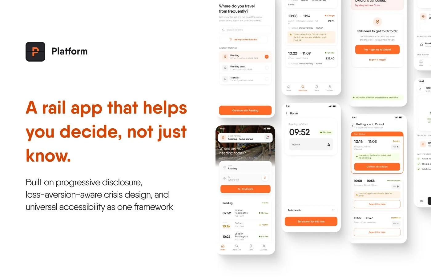
Overview
Most rail apps in this category share the same failure modes: information overload as default, cancelled trains that disappear from live boards instead of staying visible, accessibility bolted on as a settings-page checkbox, and navigation that falls apart exactly when a user is most stressed: standing on a platform, running late, trying to make a decision fast. Platform takes a different approach: treat rail travel as the high-anxiety, time-pressured activity it actually is, and evaluate every design decision against the worst moment a user might be in, not the calm one.
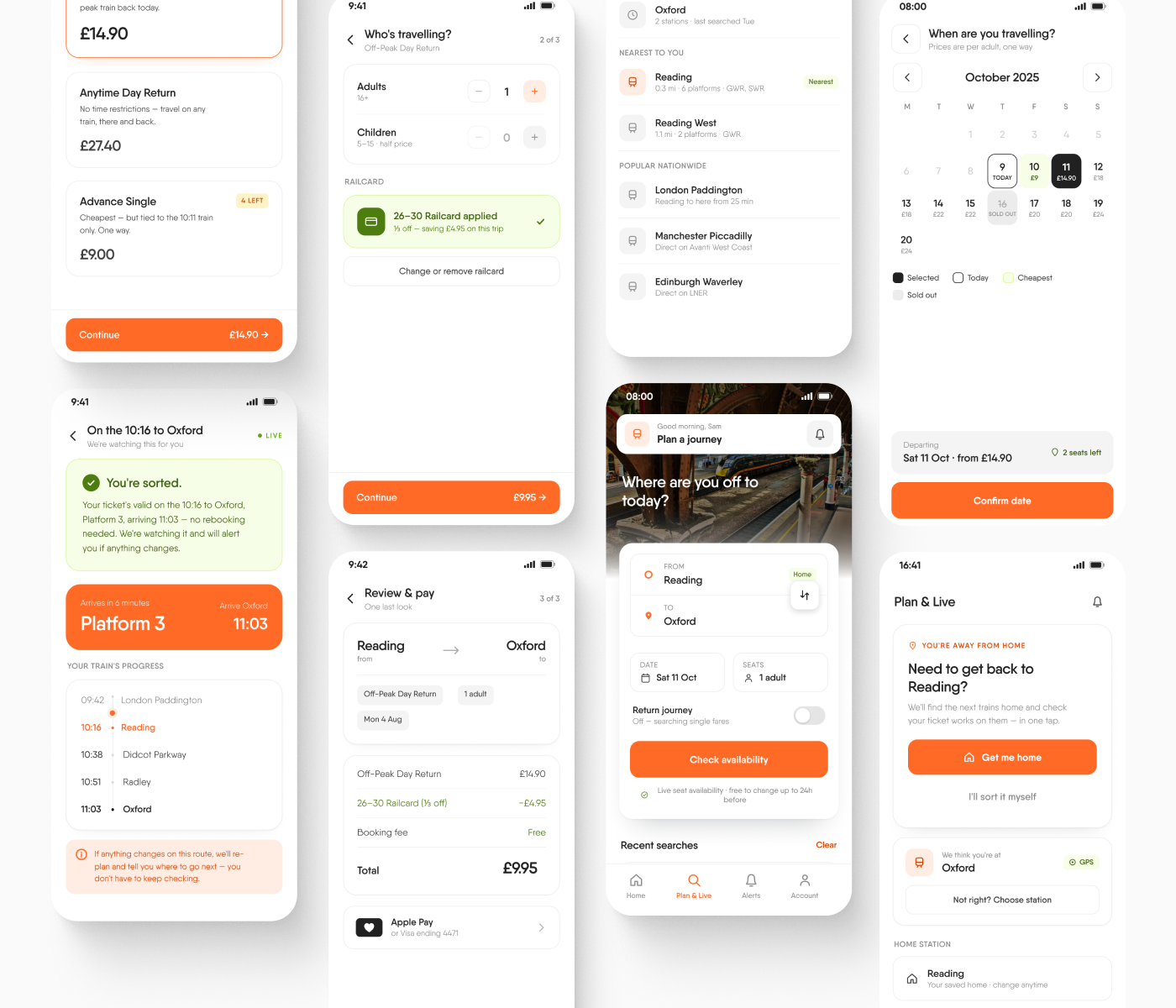
The result is a full journey experience for a fictional rail app: live boards, journey planning, disruption recovery, ticket buying, and universal accessibility. All designed to feel calm and legible precisely because it assumes stress rather than ignoring it.
The Problem With Rail App UX
Rail travel sits at an odd intersection: the stakes are real (missed connections, wasted time, genuine anxiety) but the interfaces are often built for a calm commuter checking tomorrow's train, not the person who's just watched their connection get cancelled with two minutes to think. Dense departure boards show everything the system knows at once from coach formation, carriage lettering and zone markers when almost none of it answers the only question being asked in the first second of looking: do I need to move, and where to? Cancelled and already-departed services routinely vanish from live boards rather than staying visible, which is actively unhelpful during the exact moment the app matters most. And accessibility is treated as a separate settings screen rather than a baseline, as if stress, low vision, and limited dexterity were edge cases rather than ordinary parts of how people actually travel.
Platform starts from the position that these aren't separate problems requiring separate fixes. They're one problem and designing for everybody rather than one simple use case actually helps everybody.
The Psychology at Play
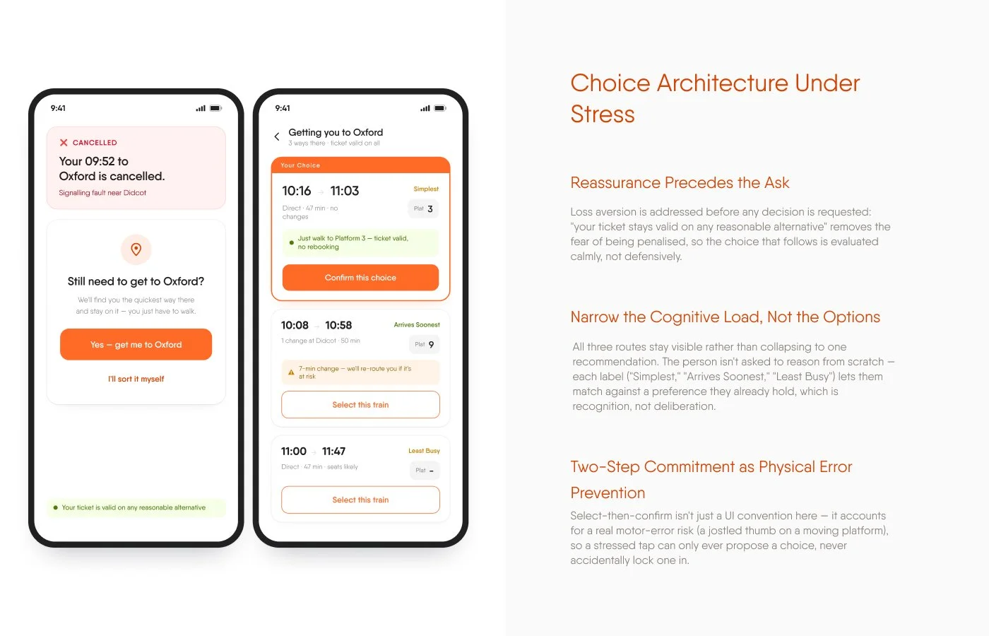
Loss aversion, addressed instead of exploited. Kahneman and Tversky's prospect theory shows people feel the pain of a loss roughly twice as strongly as the pleasure of an equivalent gain — which is exactly why a cancellation is so disproportionately stressful even when a replacement train is minutes away. Platform states the reassurance before any decision is asked of the user: "your ticket stays valid on any reasonable alternative," confirmed in plain language before the options even load, so the anxiety is closed off rather than left open while someone reads.
Cognitive load, calibrated to the worst-case user. A calm commuter checking tomorrow's train and someone who's just missed a connection with two minutes to think are shown the same interface. Every screen is designed against the second person, not the first because an interface that only works when someone's calm isn't actually solving the problem it exists for.
Plain language over technical status. "Your train is cancelled. Next train: 14:32 from Platform 3" states the practical consequence directly, rather than "service disruption affecting this route," which tells a stressed reader nothing they can act on. The gap between technically accurate and actually useful is where most rail apps lose their user.
Recognition over recall. The digital ticket borrows its layout directly from a familiar physical format — route, class, and validity as label-value pairs — so nothing needs to be learned or explained to a guard or a nervous first-time rider. Recognising a known pattern costs nothing; recalling an unfamiliar one costs attention someone under stress doesn't have to spare.
The peak-end rule. People judge an experience overwhelmingly by its most intense moment and its ending, largely ignoring everything in between. Platform's resolution screens — "You're sorted," "Head to Platform 2" — are designed as deliberate emotional closes, not just a stream of status updates that quietly trails off. A disrupted journey that resolves into a clear, calm ending is remembered very differently from one that just stops sending bad news.
UX Principles in Practice
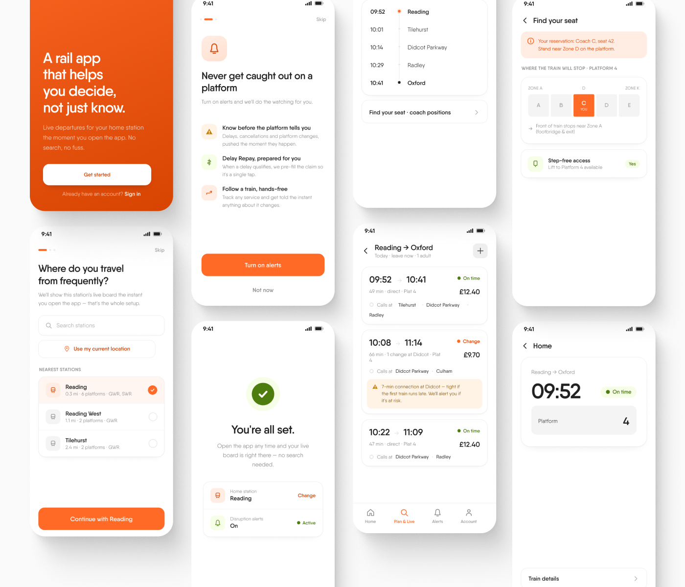
Progressive disclosure on the live board. Departure time, platform, and status answer the only question being asked in the first glance. Calling points sit one tap deeper. Coach and seat-zone detail are only relevant to someone already near the platform with a reservation. Nobody scrolls past complexity they didn't come for.
Object permanence for disrupted journeys. When a cancelled train simply disappears from a board, the user can't tell "this never ran" from "something happened to it." Platform keeps every cancelled entry visible, struck through and labelled, in its original position, the record stays intact instead of just resetting.
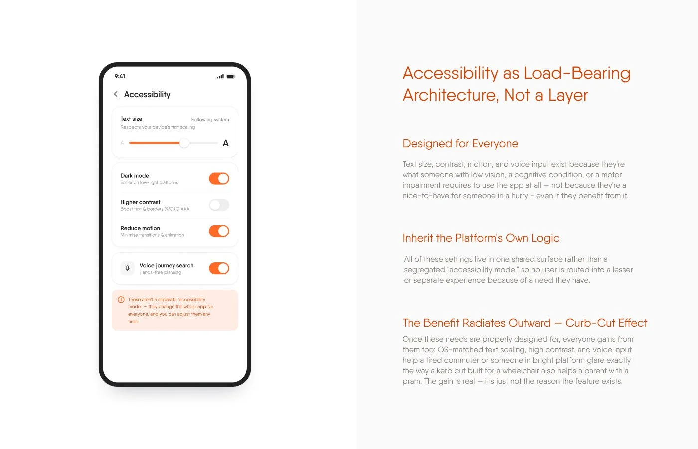
Universal accessibility, not a separate mode. Text size, contrast, motion, and voice input all live in one shared settings surface, described plainly as changing the whole app for everyone, not a segregated "accessibility mode" that routes anyone into a lesser experience because of a need they have.
The benefit radiates outward: curb-cut effect. Once these needs are properly designed for, everyone gains from them too: OS-matched text scaling, high contrast, and voice input help a tired commuter or someone reading a screen in bright platform glare exactly the way a kerb cut built for a wheelchair also helps a parent with a pram. The gain is real, it's just not the reason the feature exists.
Visual Identity
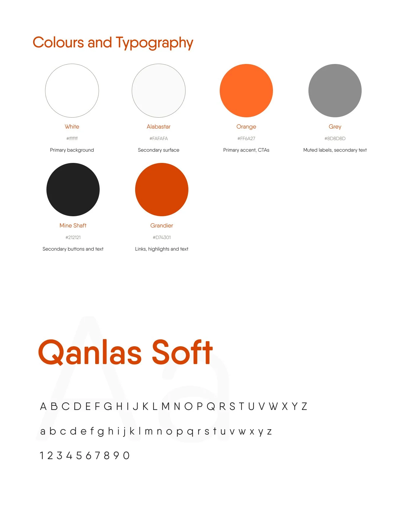
Platform's palette is deliberately bright and high-contrast — white and near-white surfaces, a single confident orange reserved almost exclusively for calls to action, and near-black used sparingly for secondary buttons and body text. This is an interface meant to be read at a glance, in daylight, on a platform, sometimes through glare so clarity and speed of recognition matter more here than mood-setting. The single accent orange is used consistently enough that its meaning never has to be relearned: if it's orange, it's the primary action.
Typography is a single family, Qanlas Soft, used across headlines, body copy, and UI labels alike, differentiated by weight and size rather than by switching typefaces. That's a deliberate choice for a category where legibility under stress matters more than typographic personality: one consistent, highly legible rounded grotesque removes any risk of a serif-versus-sans clash competing for attention when someone's trying to read a platform number in ten seconds. The rounded terminals keep it approachable without sacrificing clarity with warmth without softness where it would cost comprehension.
What's Deliberately Not Here
Dark patterns work by manufacturing urgency or hiding cost until it's too late to reconsider. Platform is built on the bet that neither is necessary for a rail app to feel fast, clear, or worth using:
No artificial urgency on ticket pricing ("prices may rise soon!") unless genuinely true and disclosed
No dark patterns around any premium or ad-free upsell
No gamification of travel: no streaks, no badges, no turning a commute into a hobby it was never meant to be
No cancelled or delayed service ever silently disappears from a board instead every state stays visible until the user has actually seen it
Final Thought